

Table of Contents
- Why Color Alternatives Matter in Stationery Design
- Understanding Color Psychology and Visual Mood
- Stationery Color Palette Inspiration: From Muted to Vibrant
- How to Choose Stationery Colors for Your Creative Projects
- Best Color Combinations for Wedding Stationery and Events
- Sustainable and Eco-Friendly Pigment Alternatives
- Digital vs. Physical Color Matching for Stationery
- Culturally Inspired Stationery Colors and Designs
Last Updated: August 16, 2026
Why Color Alternatives Matter in Stationery Design
Color isn't decoration, it's communication. The right palette transforms how people connect with your message. At African American Expressions, we understand that culturally inspired color choices carry meaning beyond aesthetics. They tell stories, honor heritage, and create emotional resonance that generic schemes cannot match.
Color alternatives for stationery now encompass rich earth tones, vibrant cultural hues, sustainable pigments, and palettes designed for different skin tones and cultural contexts. This expansion matters because it acknowledges the diversity of who's using stationery and what they're trying to express. The challenge is navigating this landscape without guidance: Which palette serves your purpose? Should you embrace muted tones or vibrant hues? What makes a color choice work for weddings versus creative projects? These questions require understanding color theory, cultural context, and practical application.
Understanding Color Psychology and Visual Mood
Color psychology shapes perception before a single word is read. Each hue triggers emotional responses that influence how recipients interpret your message.
Warm colors, deep oranges, rich golds, warm reds, create feelings of energy, celebration, and connection. They work well for invitations and stationery meant to inspire action. Cool colors like deep blues, greens, and purples evoke calm, trust, and sophistication, ideal for professional correspondence. Neutrals, charcoal, warm grays, natural taupes, provide grounding and work well as companions to bolder accent colors.
Cultural context adds another dimension. Rich jewel tones, deep purples, emeralds, and sapphires appear frequently in African and African American design traditions, symbolizing royalty, abundance, and celebration. Understanding these associations helps you make intentional choices.
Stationery Color Palette Inspiration: From Muted to Vibrant
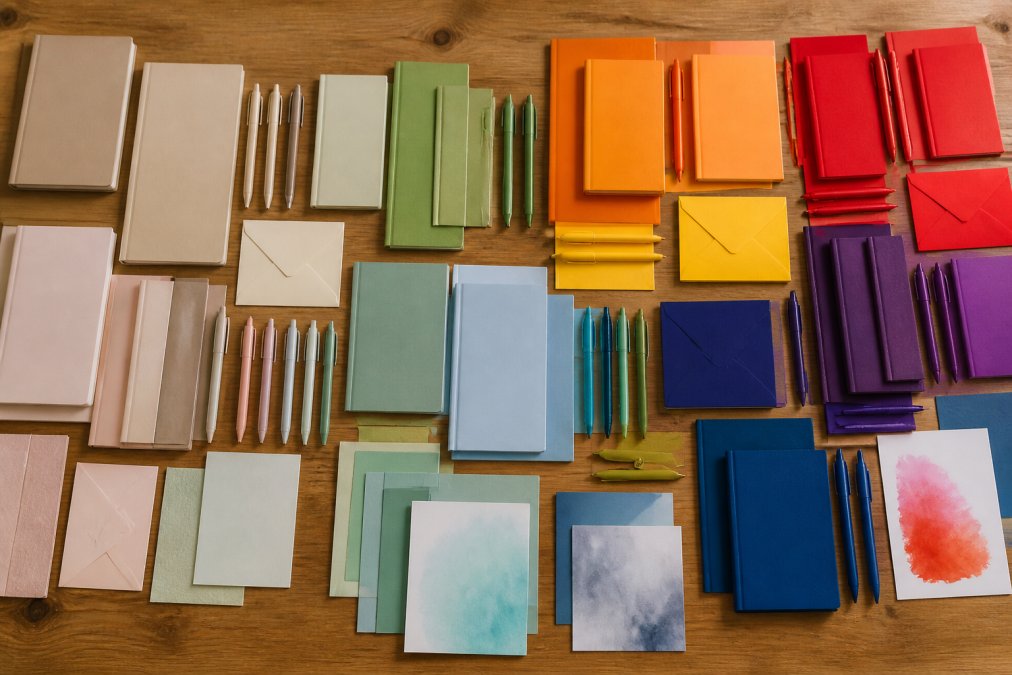
The spectrum of available color alternatives ranges from deeply subdued to intensely saturated, each serving different purposes.
Muted and Subdued Ink Options
Muted shades, soft grays, dusty roses, warm taupes, sage greens, convey elegance and restraint. These subdued options work for professional stationery, formal invitations, and minimalist designs. They pair beautifully with premium paper stocks because they complement rather than compete.
The key is ensuring muted tones don't read as washed out. Paper quality is critical. Muted charcoal on bright white feels crisp and intentional; the same charcoal on cream feels warmer and refined. Wedding stationery, professional letterhead, and sympathy cards all benefit from muted palettes because the restraint itself communicates respect and sophistication.
Vibrant Hues and Saturated Pigments
Vibrant hues and saturated pigments demand attention and work when you want stationery to feel energetic, youthful, or celebratory. Deep jewel tones, bold primary colors, and rich shades shine in creative industries, event invitations, and stationery for entrepreneurs and artists.
True saturated colors require quality ink and compatible paper. Premium stationery using vibrant hues invests in proper color matching to ensure reproduction matches the designer's vision. Vibrant palettes work best with strategic restraint: one vibrant primary color with supporting neutrals creates sophistication, while three saturated colors used equally creates chaos.
Vintage and Pastel Tones
Vintage and pastel tones occupy a middle ground, softer than vibrant but more present than muted. Soft yellows, gentle pinks, pale blues, and warm creams evoke nostalgia and approachability. These work well for baby showers, bridal stationery, and retro-inspired designs.
Vintage tones aren't washed out; they're intentionally warm with brown or orange undertones that feel authentic to a specific period. Pastel stationery works best on premium paper stocks, thin, cheap paper makes pastels look washed out and inexpensive.
How to Choose Stationery Colors for Your Creative Projects
Selecting the right palette requires moving beyond personal preference into strategic thinking aligned with your project's goals and audience.
Color Theory Basics for Non-Artists
The color wheel organizes hues into relationships. Complementary colors sit opposite and create maximum contrast. Analogous colors sit adjacent and create harmony. Understanding these relationships helps you build palettes that either pop with contrast or flow cohesively.
Color temperature divides the spectrum into warm (reds, oranges, yellows) and cool (blues, greens, purples) tones. Warm colors feel energetic; cool colors feel calming.
Saturation and value matter as much as hue. A color palette using the same hue at different saturation levels and values creates depth without chaos.
For non-artists, the simplest framework is the 60-30-10 rule: choose one dominant color (60%), a secondary color (30%), and an accent color (10%).
Balancing Color Contrast and Harmony
Effective stationery balances readability with aesthetic appeal. High contrast ensures legibility, but harmony creates sophistication. A wedding invitation using black text on white is maximally readable but feels stark. Adding a subtle accent color maintains readability while introducing visual interest.
Color contrast affects accessibility. Text lacking sufficient contrast becomes difficult for people with color blindness or low vision. When selecting stationery colors, test whether your combinations work for different types of color vision. WebAIM's color contrast checker provides tools to verify accessibility standards.
Become a part of our AAE family and start fundraising today! →
Harmony comes from restraint. Limiting your palette to three colors maximum creates cohesion. Using colors that share similar saturation or temperature creates visual unity.
Best Color Combinations for Wedding Stationery and Events
Wedding stationery must feel timeless enough to appear in photographs for decades while reflecting the couple's personality. Successful palettes anchor around one primary color with supporting neutrals: navy with gold creates classic elegance; blush pink with sage green feels romantic and modern; deep emerald with cream communicates luxury.
Seasonal context influences wedding color choices. Spring weddings embrace pastels; summer events use vibrant jewel tones; fall weddings gravitate toward warm earth tones; winter events feature deep jewel tones or cool silvers and blues.
Event stationery for galas and celebrations benefits from colors that photograph well. Deep, saturated colors often photograph better than pastels under typical indoor lighting. Metallic accents add visual interest and dimension. African American Expressions offers culturally inspired stationery options that incorporate rich color palettes specifically designed for celebrations and milestones, recognizing that color choices carry cultural meaning beyond generic options.
Sustainable and Eco-Friendly Pigment Alternatives
Growing environmental consciousness has driven innovation in stationery pigments. Plant-based inks derived from soy or algae provide vibrant colors without petroleum-based components and are easier to remove during recycling. Mineral-based pigments from naturally occurring materials create warm, earthy palettes. Water-based inks use water as a carrier instead of petroleum solvents, reducing emissions.
The trade-off typically involves cost and availability. Eco-friendly inks often cost more, and not all printers have the equipment. However, the environmental benefit aligns with the values of many stationery buyers seeking products reflecting commitment to community wellbeing.
Digital vs. Physical Color Matching for Stationery
A common frustration occurs when colors selected on screen don't match the printed product. Digital screens use RGB (red, green, blue) color mixing through light. Physical printing uses CMYK (cyan, magenta, yellow, black) color mixing through pigment. These systems produce different color ranges.
Accurate color matching requires requesting physical color samples from your printer. A printed swatch card shows exactly what the color will look like on your specific paper stock. Professional printers often provide color matching services, producing test prints before running full orders. This prevents expensive reprints if colors don't match your vision.
Culturally Inspired Stationery Colors and Designs
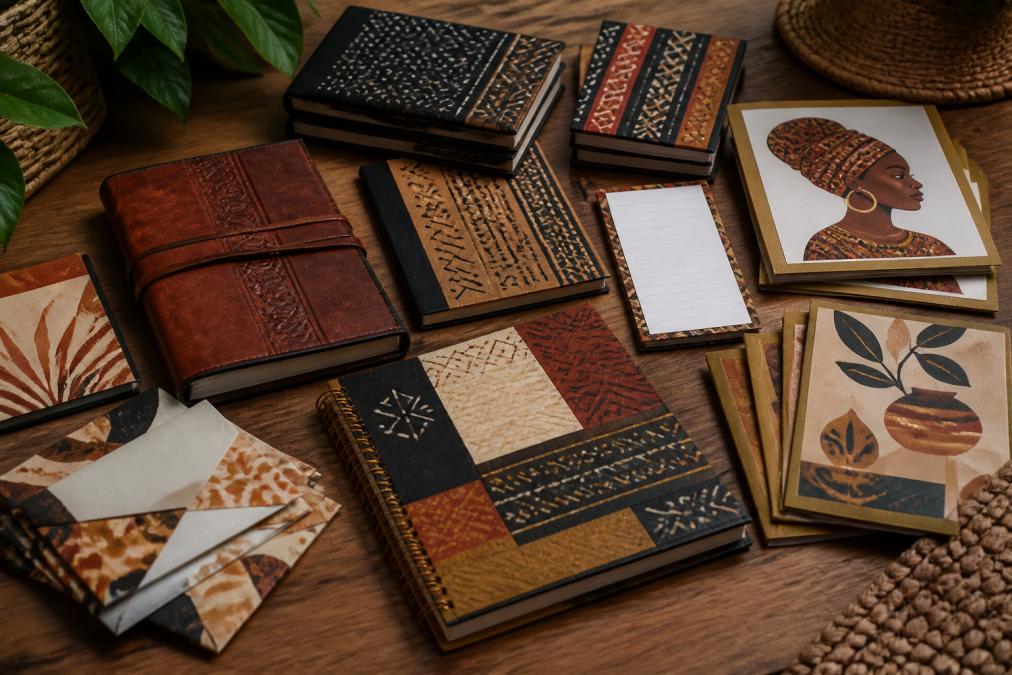
Culturally inspired color palettes carry meaning extending beyond aesthetic preference. These choices honor traditions, celebrate heritage, and create stationery reflecting the identity and values of users.
African and African American design traditions feature rich, warm color palettes. Deep golds and bronzes evoke precious materials and celebration. Rich purples, emeralds, and sapphires reference royal traditions. Warm terracottas and earth tones connect to natural materials and ancestral traditions. These colors appear as intentional choices within design systems developed over generations.
Culturally inspired stationery recognizes that one-size-fits-all palettes erase important visual traditions. A wedding invitation honoring heritage benefits from color choices reflecting that heritage. Stationery for community gatherings gains authenticity through culturally rooted palettes.
Organizations like African American Expressions specialize in stationery integrating culturally inspired colors with meaningful designs. These products move beyond surface-level representation to create stationery genuinely reflecting the aesthetic and values of Black communities. When selecting culturally inspired stationery, consult with designers familiar with specific cultural traditions to ensure your color choices reflect authentic aesthetics rather than stereotypical assumptions.
Selecting the right color palette for stationery means moving beyond what's available to what's meaningful. Whether you're drawn to muted sophistication, vibrant celebration, or culturally rooted traditions, your color choices communicate before any words are read. African American Expressions offers stationery collections featuring thoughtfully selected color palettes designed to celebrate heritage, support community organizations through our fundraising program, and ensure your stationery reflects the values you want to express. Explore options that resonate with your aesthetic and values, your stationery deserves colors that tell your story authentically.
Frequently Asked Questions
What are the best color alternatives for stationery if I want muted, sophisticated tones?
Muted stationery colors include soft sage green, warm taupe, dusty rose, charcoal gray, and cream. These subdued inks work well for professional correspondence, wedding invitations, and minimalist designs. Muted palettes reduce visual intensity while maintaining readability. Pair these with high-quality paper to enhance the sophisticated aesthetic. Many creatives choose muted shades for their calming effect and timeless appeal in both personal and business applications.
How do I choose stationery colors that work together harmoniously?
Start with a primary color that reflects your mood or brand, then apply color theory principles. Use analogous colors (those next to each other on the color wheel) for harmony, or complementary colors (opposite on the wheel) for contrast. The 3-color rule, combining one dominant color with two accent colors, creates balanced, professional stationery. Test your color palette on actual paper samples, as ink appearance varies by substrate. Consider the paper's texture and finish, as they affect how colors appear.
What color combinations work best for wedding stationery?
Popular wedding stationery combinations include blush pink with gold accents, navy blue with ivory, sage green with cream, and burgundy with champagne. Seasonal considerations matter: spring weddings suit pastel combinations, while fall events pair well with warm earth tones. The color palette should reflect the wedding's overall aesthetic and venue. Ensure sufficient contrast between text and background for readability. Soft, romantic colors create intimate feelings, while bold contrasts convey modern elegance. Always request sample cards before final printing.
Are there sustainable alternatives to traditional colored pencil pigments?
Yes. Eco-friendly stationery options use plant-based inks, mineral pigments, and water-soluble dyes instead of synthetic chemicals. Soy-based inks and vegetable pigments reduce environmental impact while maintaining vibrant color saturation. Some sustainable brands use natural colorants derived from clay, charcoal, and plant extracts. When selecting eco-friendly stationery, verify certifications like FSC for paper and check for non-toxic, biodegradable formulations. These alternatives often provide comparable color intensity and longevity to traditional options while supporting environmental responsibility.
How does color psychology influence stationery design choices?
Color psychology affects how stationery is perceived and used. Blue conveys trust and professionalism; green suggests growth and calm; red energizes and draws attention; purple implies creativity and luxury; warm neutrals feel approachable. Your color choice shapes the recipient's emotional response and the stationery's effectiveness. For professional correspondence, blues and grays build credibility. Creative projects benefit from vibrant hues and bold contrasts. Wedding stationery typically uses soft, romantic colors to set emotional tone. Understanding these associations helps align your stationery colors with your intended purpose and audience response.
This article was written using GrandRanker